Vacation Rentals of Santa Barbara
Printed Marketing Collateral
Vacation Rentals of Santa Barbara is the longest established vacation rental agency in the Santa Barbara area. For this project, the company owner hired me as lead designer to design a variety of print collateral, including brochures, magazine advertisements, and a banner. I sought feedback from my client and worked to ensure that her goals were met and that the end products were cohesive with existing brand materials.
Overview
My client wanted to boost their marketing efforts to be more competitive with other market players. In the past, her business development was primarily driven by reputation and word of mouth, but she understood that having a marketing presence in the area was important going forward. To remain competitive, she wanted a polished full-page magazine ad, brochures, and a stand-up banner to boost brand recognition.
Goals
The primary focus for this project was to ensure cohesion of the existing brand identity and the new materials needed to propel the brand forward. The new materials needed to have the same look and feel as the established brand and website, and ensure that they were easily recognizable as Vacation Rentals of Santa Barbara. They needed to be fresh and revitalized, while seamlessly blending in with the existing brand.
Print Advertisement Iterations
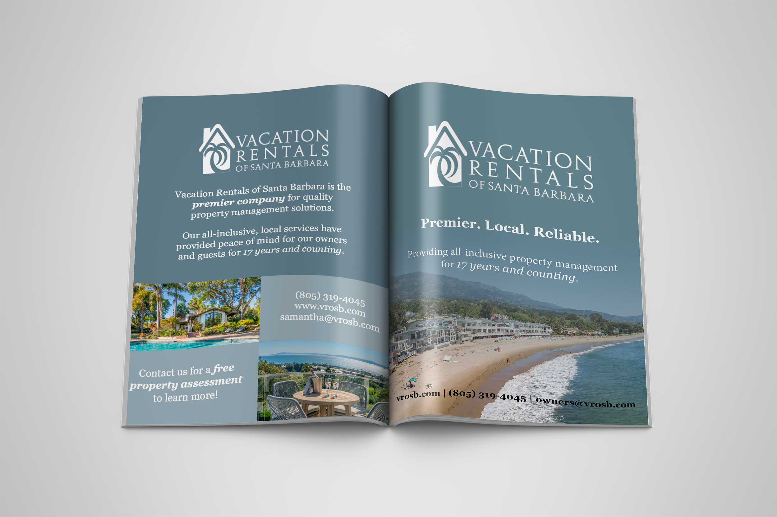
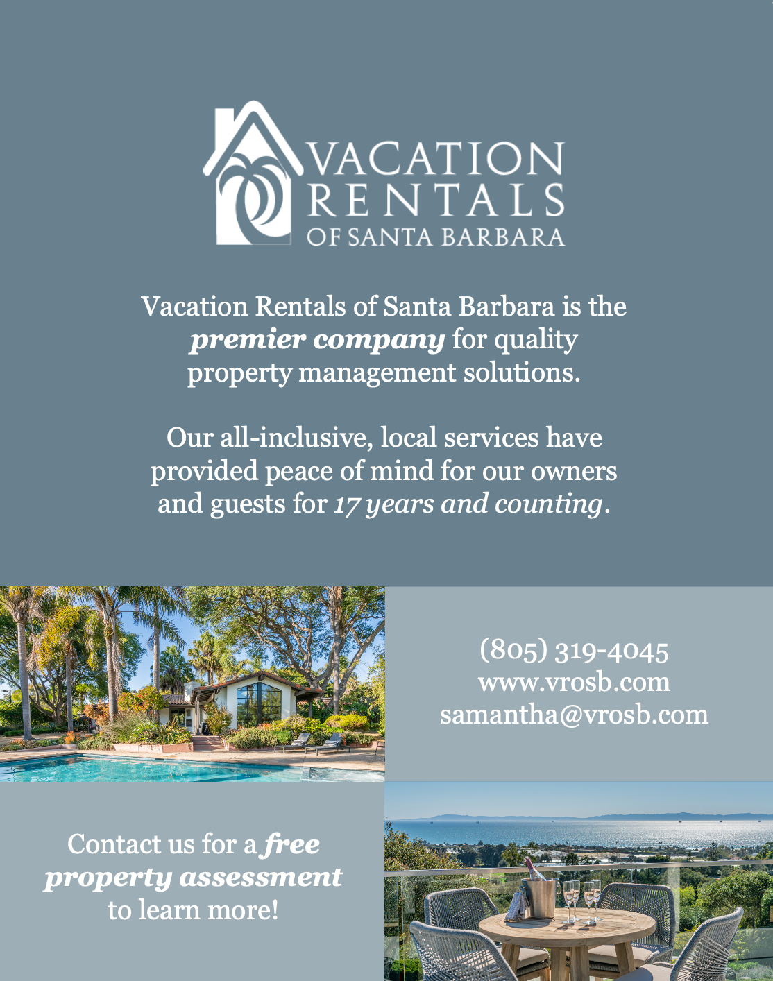
I first started with the print advertisement to be featured in a local magazine. The first iteration, that was published in the first edition we started participating in, was based on the client’s existing website layout. The website’s home page has a main hero image, then alternating blocks of images and wording below. This worked well and definitely felt like a cohesive extension of the existing brand’s look and feel.
After seeing the advertisement in print, however, my client and I agreed that it was too busy considering the surrounding pages and advertisements included in the magazine. I noted that there were three main elements to successful advertisements in the magazine:
Minimal photos- one to two images max
Minimal wording- a catch phrase or slogan of the brand
Easy to identify contact information
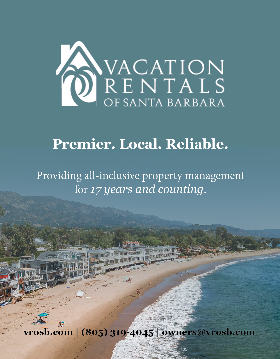
That is why my second iteration of the advertisement, published in the following edition, was more streamlined; it had one photo in the background that faded at the top into the brand’s main color. The logo was large and towards the top, and only a short tagline and contact information were included. Following the first print of this second version, my client agreed to use the same advertisement for future editions for the print year to establish continuity. It has been printed 3+ times since, and the feedback has been positive.
Brochure
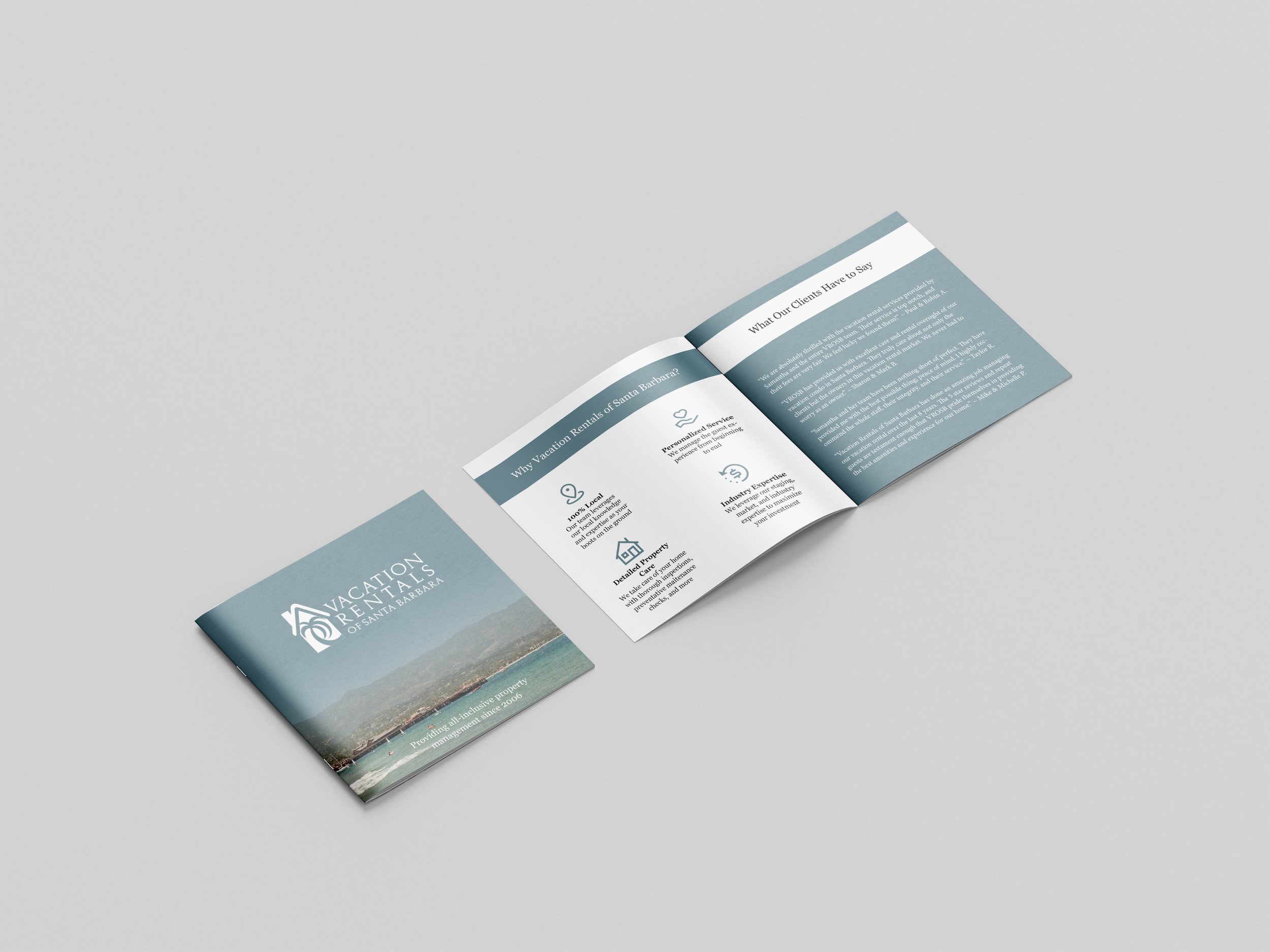
To differentiate my client from her competitors, I knew I wanted to make the brochures as a bi-fold square shape for a more elevated look and feel. This custom element, compared to standard tri-fold brochures, further helped my client stand out and offered an elevated way to display only the most important information required.
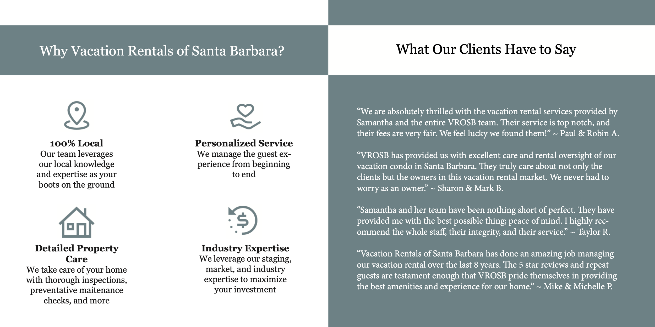
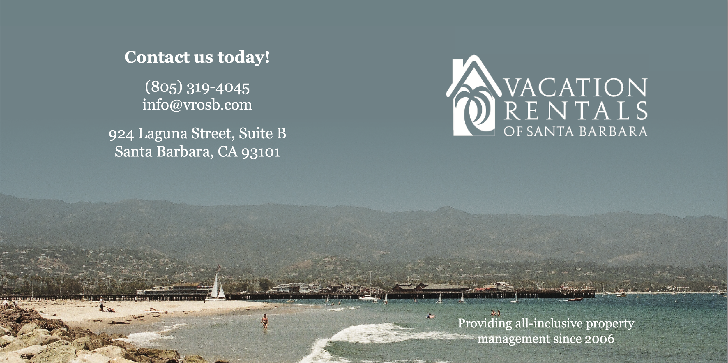
The design for the brochure has the same look and feel of the second iteration of the magazine ad, to ensure brand continuity and recognition. The intended audience for the magazine ad was the same for the brochure. The front and back of the brochure has a beach scene that fades into the brand’s shade of teal at the top, with the logo and minimal white lettering. The interior of the brochure is clean and concise, with one side noting four main offerings of VROSB, told by icons and short summaries, and the other highlighting client feedback. My client wanted to ensure that the inside of the brochure was streamlined and fresh, without being too wordy or having too many distracting images on it. The end result included enough visual iconography to remain interesting without being distracting.
Banner
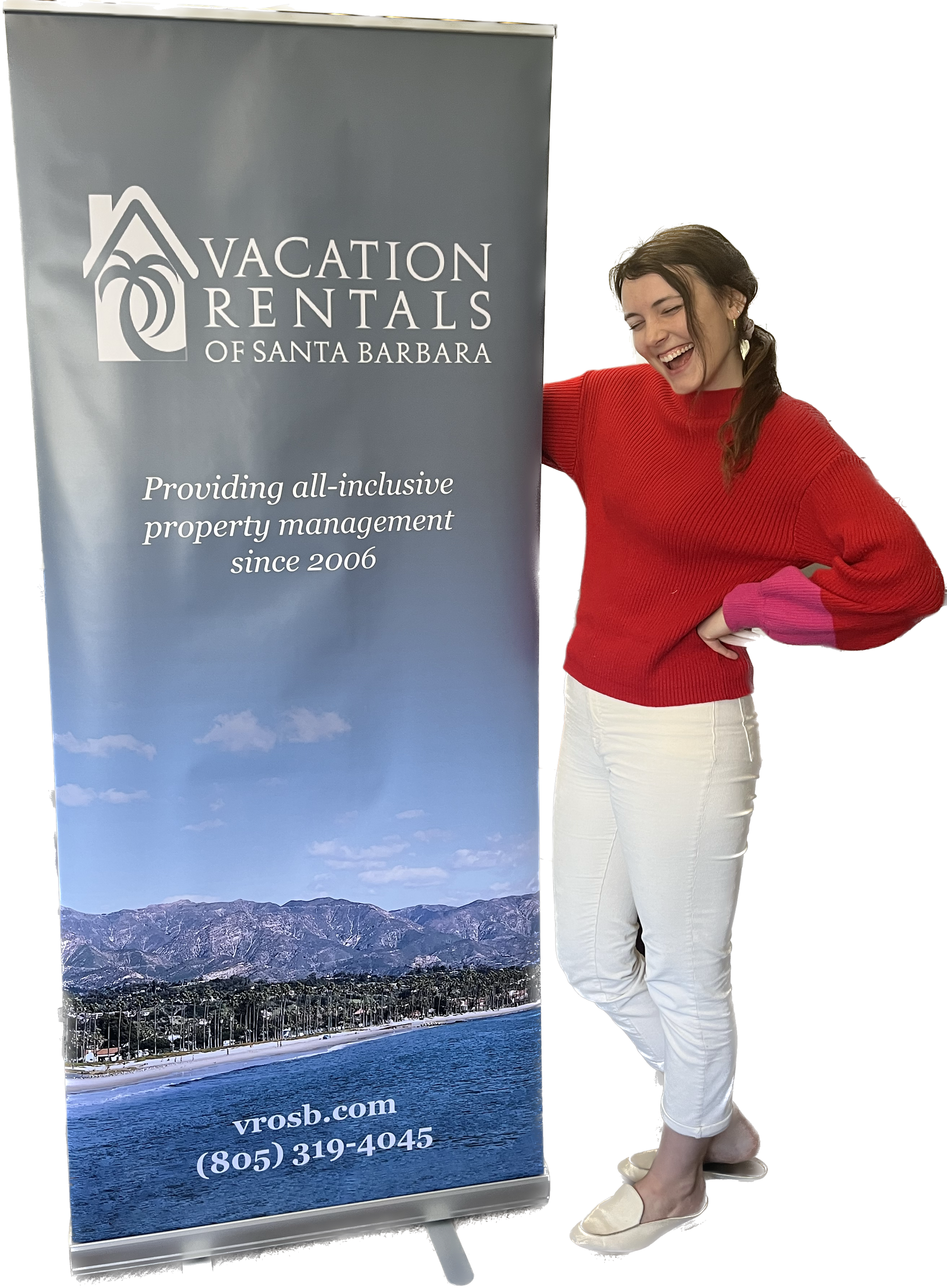
Similar to the brochure, the banner was crafted after the magazine advertisement and carried over many of the same design elements to ensure continuity and brand recognition. The purpose of the banner was to signify what VROSB was at a glance. Because the banner likely would be placed behind or to the side of tables, I wanted to ensure that the main logo and message was towards the top and sure to be visible. To create visual symmetry, however, I included the shorthand website address along with the company phone number towards the bottom. If the contact information was not fully visible (for example if the banner was behind a table), it wouldn’t impact the goal of the banner which was to signal what VROSB was. If the banner was doing its job, those interested would come to a table and grab a brochure, with the contact information on it.
Takeaways & Conclusion
Truthfully, when first approached about this project, I was unsure of where to start. I wanted to respect and do justice to the 18 year old brand while also breathing new life into it. The brand did not have an existing style guide to work off of either. However, by studying what my client produced in the past along with a market analysis of current industry marketing, and our feedback iterations, I am confident that I fulfilled my client’s desire for new, cohesive print marketing materials. I utilized the same color scheme and typefaces to ensure that the new material felt like an extension of the existing brand, without looking directly like what had been done by my client or by competitors in the past.
In conclusion, my client now has print marketing collateral that elevates her brand for future events (banner), client meetings (brochure), and print advertisements (magazine ad). They are all cohesive yet unique, and can be customized by changing the background image and/or tagline as needed. This helps my client’s business grow now and in the future.
