The Whole Bean
Comprehensive Brand Identity Design
The Whole Bean is a neighborhood coffee shop looking to differentiate itself with its design and services. I was hired as the lead designer responsible for creating a comprehensive brand identity design, including a color scheme, type scale, logo, icon set, and full style guide. I also assisted the owner in developing a mission statement, which helped guide my design process.
Overview
The Whole Bean is a local coffee shop that serves specialty coffee and teas, artisan pastries, and good vibes. Karla, the owner of The Whole Bean, wanted her cafe to be an approachable and welcoming community hub in the neighborhood. She knew that they aren’t a household name like Starbucks, but wanted to establish herself in the community through a friendly, inviting, and memorable brand and environment. It was important for me to choose colors, fonts, and images that embodied those themes and created a cohesive look and feel.
Goals
In discussing the role we see The Whole Bean fulfilling in the community, the owners and I settled on the mission statement of:
“We serve our neighbor by being their go-to spot for caffeine and community.”
My goal was to infuse this mission statement into all brand and marketing collateral so that the welcoming nature of The Whole Bean was palpable to neighbors and visitors alike. The owners wanted their coffee shop to feel:
inviting
comfortable
contemporary
fun
This dichotomy between comfortable and contemporary was woven into every design decision, and made this project a delightful challenge.
I worked with the owners to hone in on their target audience, then was given a timeline of 3 months to complete the entire brand identity design so that the owners could implement the designs and print materials prior to opening day.
Color Scheme
When honing in on the main color for The Whole Bean brand, I initially settled on deep emerald green because it symbolizes freshness and health. It is a distinguished color while also being trustworthy and approachable. However, after further reflection and feedback, it was determined to be too similar to the green hues of their competitor, Starbucks, so I pivoted.
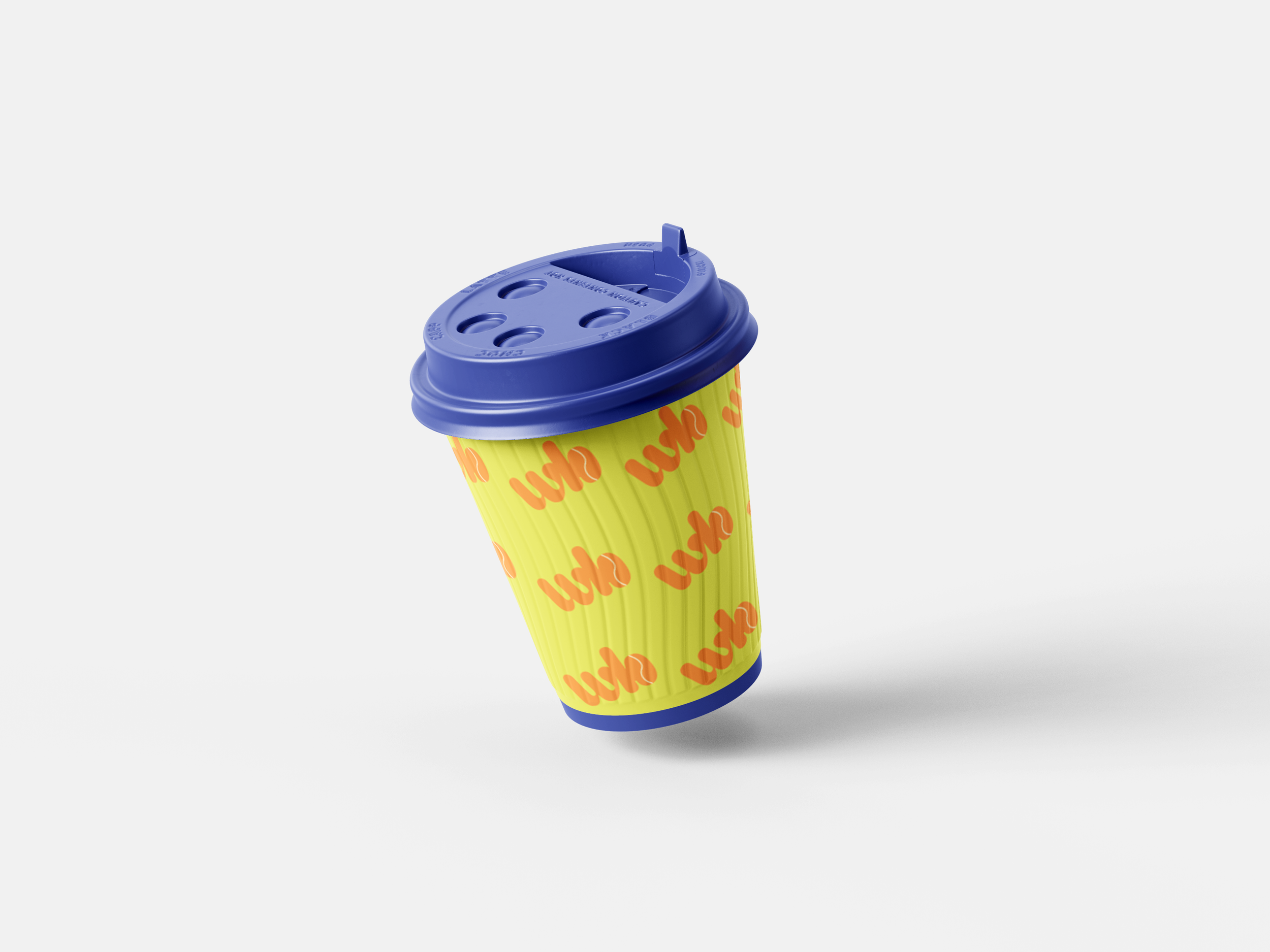
I ended up on a trio of bright, complementary shades with an accent color of a warm cream. Indigo, orange, and lime green together create a feeling of fun and comfortability- they are approachable and inclusive, just like The Whole Bean is. The colors are also memorable, which was a primary goal for this brand.
Typography
For the brand’s typography, I settled on Bagel Fat One, a sans-serif font that oozes playfulness and fun. It is memorable and contemporary, just like The Whole Bean. To further play into the approachable side of the brand, I made the logo all lowercase. The body supporting text font is Avenir, which is a clean sans-serif. The sharp lines of Avenir playfully contrast with the exaggerated roundness of Bagel Fat One.
An earlier version of the typography for The Whole Bean included two serif fonts, HV Weist Havanah and Inria. During one of our rounds of revisions, the owners noted that the original fonts felt too formal for their inviting and comfortable coffee shop, which I agreed with. I am really satisfied with the two fonts we ended up with because they are fresh and fun, and better align with The Whole Bean’s mission of being an inclusive neighborhood hub.
Logo
When designing the logo, I had three main goals of the brand in mind to convey the mission and purpose of The Whole Bean. The main logo of The Whole Bean had to be:
approachable
contemporary
friendly
To execute this, I used the main font (Bagel Fat One) as it already helped convey the approachable, contemporary vibe of The Whole Bean. There are two logo variations: one with the entire brand name in varying sizes, and one with just the initials “WB”, and the “b” being a coffee bean.
The main logo with the entire brand name ensures that the brand in its entirety is recognized and known. “The” is at a 90 degree angle, with “Whole” and “Bean” being stacked parallel to each other horizontally. “Bean” is a slightly larger font size than “Whole” so that it fills the same amount of space, and “the” transcends both lines to ensure cohesiveness.
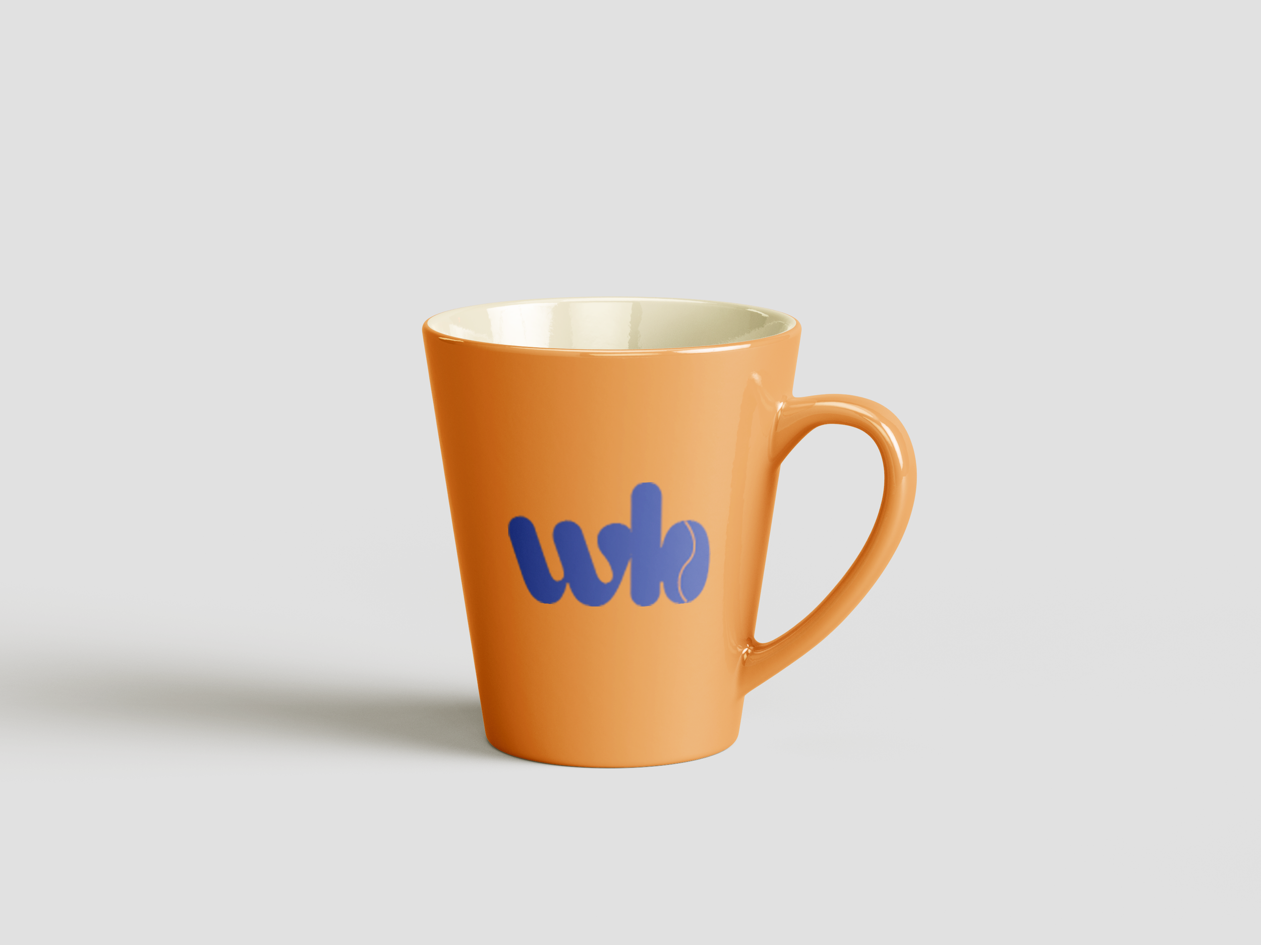
The logo variation of “WB” is shorthand for The Whole Bean, and the “b” in “WB” has a coffee bean in it. The two letters are touching, which I did intentionally to signify “the whole bean” as one cohesive entity, playing off of its name. To appeal to the brand’s multi-generational audience, I wanted to ensure there was a catchy nickname showcased in logo variation. When I thought about the audience profiles, I could easily see certain customers saying “Meet me at WB” instead of “Meet me at The Whole Bean”.
In creating the two logo variations, one with the full name and one with the cafe’s nickname, it helps the brand appeal to more of our neighbors throughout generations. A shortened logo variation also was key for an easily identifiable social media profile picture.
Icons & Images
The icon sets I originally designed for The Whole Bean felt flat and did not convey the full dimension of the brand. The final icon set is now cohesive with the brand mission! The images I chose to supplement The Whole Bean’s marketing material are all centered around community and caffeine, and further contribute to the cohesive look and feel of The Whole Bean brand.
I used Adobe Illustrator to create the two complementary icons for The Whole Bean. One of the icons is a grouping of three coffee beans, each bathed in one of the brand’s colors. These convey a sense of fun and whimsy, while clearly signifying the coffee shop’s offerings. The other icon is a diner mug outline with the “WB” logo variation on it. This can be used for merch or menu design.
Takeaways & Conclusion
Throughout this project, I maintained close communication with the owners of The Whole Bean and stuck to a strict timeline to ensure all deliverables were presented with ample time for feedback and reiterations. Through my editing and the client’s feedback, I was able to rework some of my original designs so that the end result was inviting and memorable, and stood out as being a neighborhood hub for community and caffeine. I utilized multiple design programs, including Adobe Illustrator, Photoshop, and InDesign to create collateral that had the same look and feel.
In conclusion, the owners of The Whole Bean were presented with a complete brand package, including a color scheme, type scale, logo, logo iterations, icons, images, and a style guide. To view the full-size brand style guide, please click HERE! These were delivered within the 3 month timeline to ensure that the owners had plenty of time to print and utilize the materials in preparation for opening day. Because The Whole Bean now has a cohesive look and feel, the owners are able to start marketing and serving their neighbors even before opening day!


